
Finding Veda: Six months of building a brand from first principles

I was in Joshua Tree, looking out over the quiet landscape, when I heard Treasury Secretary Scott Bessent say that stablecoins would “buttress the dollar’s status as the global reserve currency.”
Hearing those words brought six years of work into perspective. I’d helped build the Circle and USDC brand from a time when the company had about sixty people and stablecoins were still unfamiliar to most. Now the US Treasury Secretary was talking about that technology’s role in the future of the dollar. What we’d helped build had become bigger than I could have imagined when I started.
I felt proud. But in that moment, I also felt how much I wanted to build again. Circle had grown, and the brand we’d spent years developing was established. I still enjoyed finding new ways to tell its story, but I missed the beginning, when there was so much left to figure out and I could help shape what it would become.
That was where I was when Veda came knocking.
Despite years working in the industry, I knew little about the company or vault infrastructure. As I learned how it could help businesses put capital to work, I recognized something from the early stablecoin experience at Circle: technology with possibilities that were difficult to understand through its existing story. Explaining those possibilities would be part of the work. Earning people’s trust would be just as important, because this was a brand they would need to trust with their money.
I sat down with Veda’s CEO, Sun Raghupathi, and was impressed by his vision. He wanted a brand that could hold its own alongside the world’s largest financial institutions. I could see where my experience would matter, and this time I had the opportunity to lead the creative direction alongside him. It felt like we’d found each other at the right time.
Finding what was already there
Before deciding what Veda should look like, I wanted to understand what we could build it around. I knew of the word Veda, but didn’t fully understand what it meant. The dictionary definition felt like an early signal that there was something bigger here that I could build from.
Veda
Sanskrit: knowledge, from the root vid, “to know.”
The Vedas are an ancient body of Hindu sacred texts, passed down through generations in an oral tradition that continues today. I found myself thinking about that continuity: knowledge people had considered worth preserving, teaching, and returning to across thousands of years. I wanted to look more closely at those texts and consider what they might teach me about building something with a lasting foundation.
Knowledge felt appropriate for a company helping people understand emerging technology. Then, beneath the familiar meaning of knowledge or wisdom, the definition I found included another: “to discover hidden wealth.”
I could understand that as spiritual enrichment, but the literal reading was hard to dismiss. People are accustomed to capital sitting idle. Veda offered businesses a way to look at those same balances and discover their potential to become productive. The name connected to both the business and how I wanted to approach the brand: understand what was already there, and strip away whatever made it harder to see.
Establishing Brand Principles
My reading of the four Vedas became the starting point for our brand principles. I translated what resonated with me into standards we could use to question a message, refine a composition, or decide whether an image belonged.
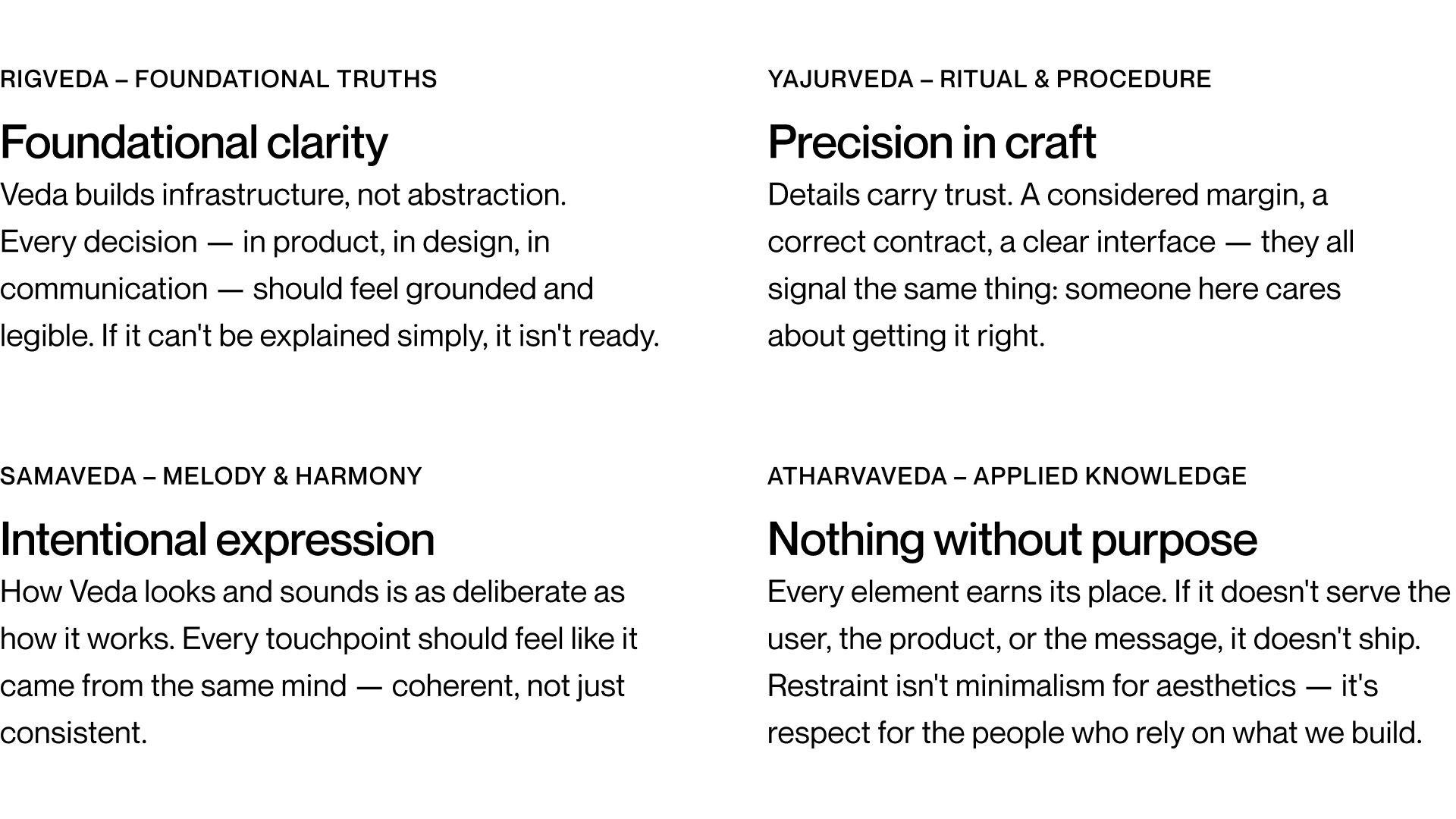
Making the value visible
With those foundations taking shape, I began looking again at the identity we’d inherited. Purple was everywhere, often paired with rotating 3D coins. Our tagline was “Vaults that do it all.” It suggested flexibility, but looking at the homepage, I struggled to understand what someone would actually use Veda to do.
Through conversations with Sun and the team, I was beginning to see the technology’s potential. The brand needed to help someone else see it too.

Working through the product over the following months helped me picture the offering as a little button called Earn inside an app. The app already had customers holding balances. Veda could help make those balances productive and offer earning to its users.
That understanding gave me a customer experience to design around. We could show someone what earning would look like in their own product, giving the homepage a clearer proposition than a broad statement about what vaults could do.
Our mark also had something worth developing: a circle within a triangle. I could see the circle as capital and the triangle as the structure within which it moved, much like vault infrastructure. The geometry felt appropriate, but the composition was static. I kept those forms, adding depth and texture and adjusting the circle’s position slightly to introduce a sense of movement.
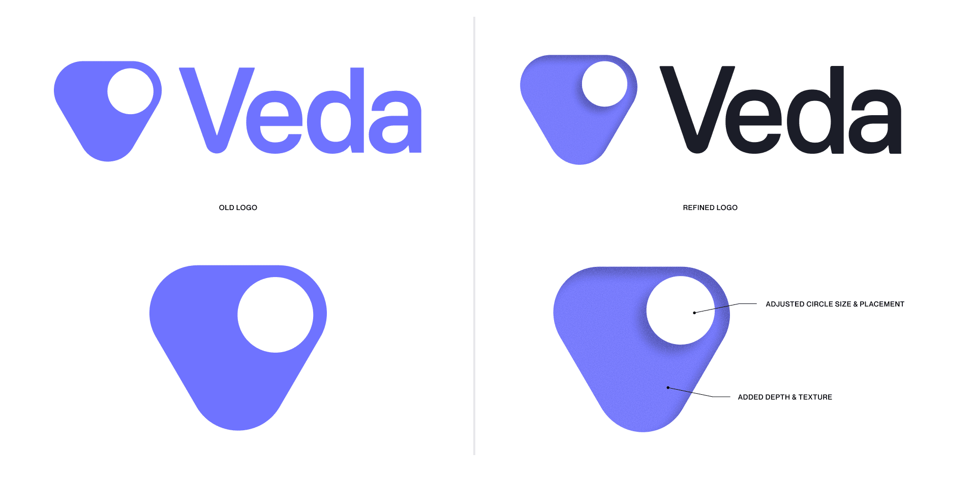
Purple felt worth keeping, but it needed a more deliberate role. My reading had led me toward The Elementals and an association between aether and purple. I began thinking about aether as a metaphor for the underlying infrastructure people experience through what it enables.
We retained purple, but limited it to one accent at a time. Across much of the site, that accent is simply the logo mark. In the Earn demonstration, purple takes on a more active role. As yield became enabled, it turned purple, drawing the viewer’s attention within a busy interface and making the change easy to recognize.

Finding a language we could build on
Earn helped clarify the customer benefit. Creating foundational decks helped me work through the infrastructure behind it. I drew diagrams to understand how the pieces connected, asking more questions whenever I couldn’t represent a relationship clearly.
As those drawings developed, they began to establish a style. Fine lines, simple forms, and restrained color gave the work an architectural quality. The paper texture reinforced that feeling, as though we were laying out a plan someone could examine and understand.
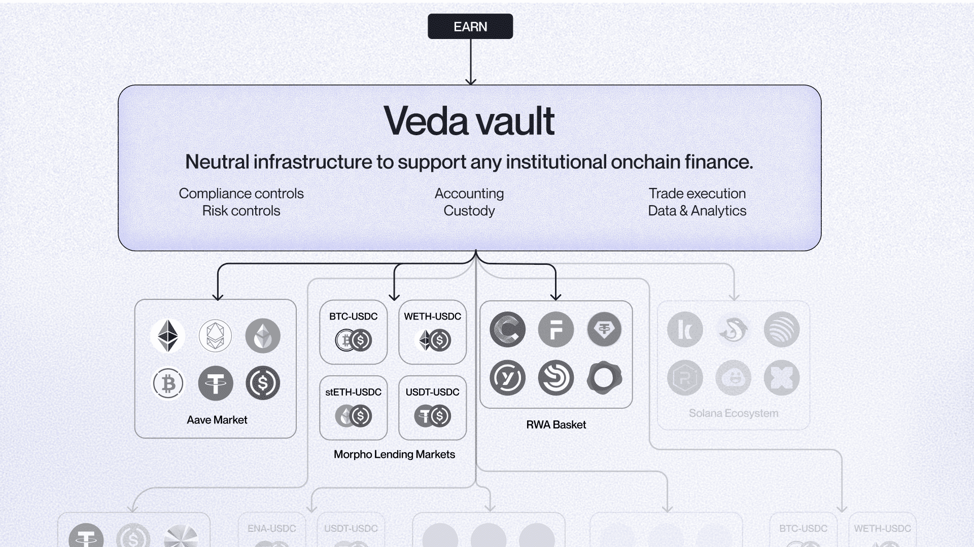
That language was useful, but it represented only part of what the brand needed. We could explain a flow of funds, yet still needed imagery that would catch someone’s attention before they were ready to study the mechanics.
I explored several directions while we continued publishing. One involved metallic rods arranged on realistic surfaces. In a deck, the treatment felt promising: the forms could suggest infrastructure shaped around a product, and the material gave the composition a tactile quality.
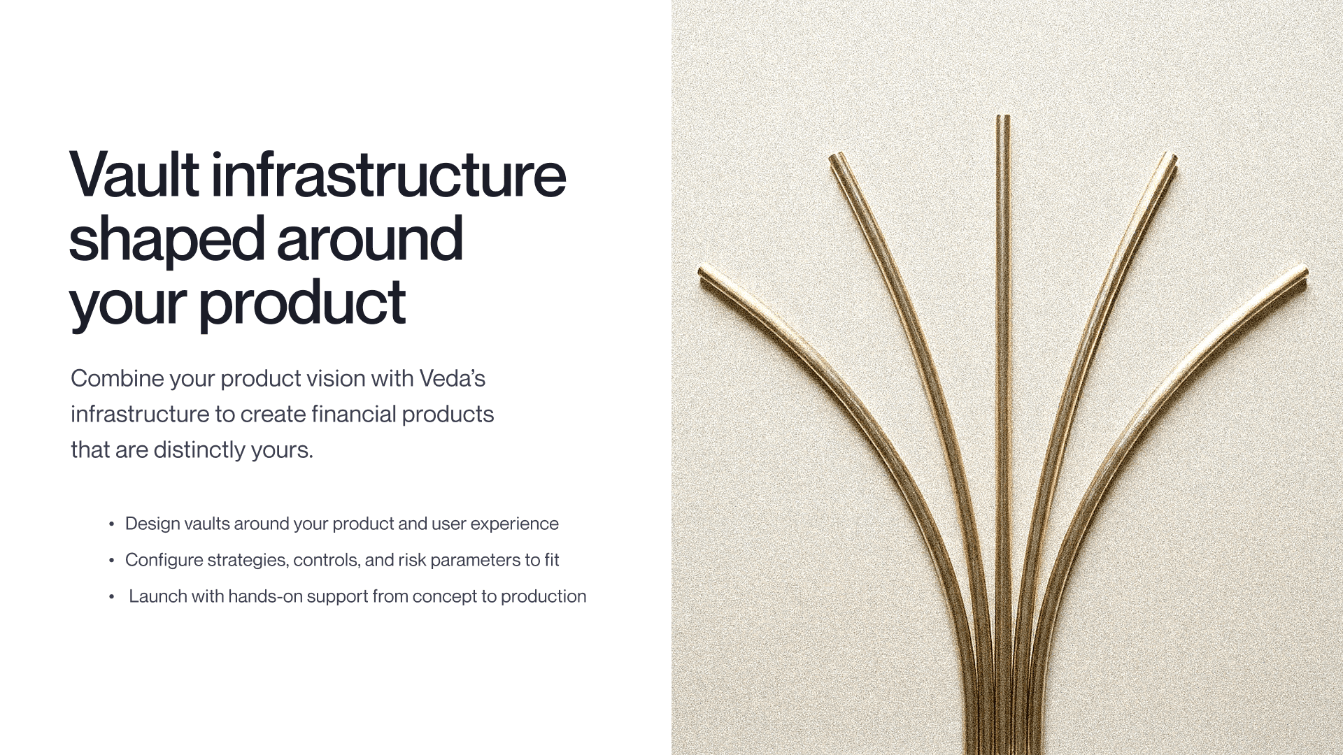
I began testing how far that language could extend. Individual images were interesting, but a wider system needed more than a collection of compositions I liked. The rods had to remain consistent, communicate something intuitively, and work alongside typography and other objects. As I explored more applications, those demands became harder to satisfy.
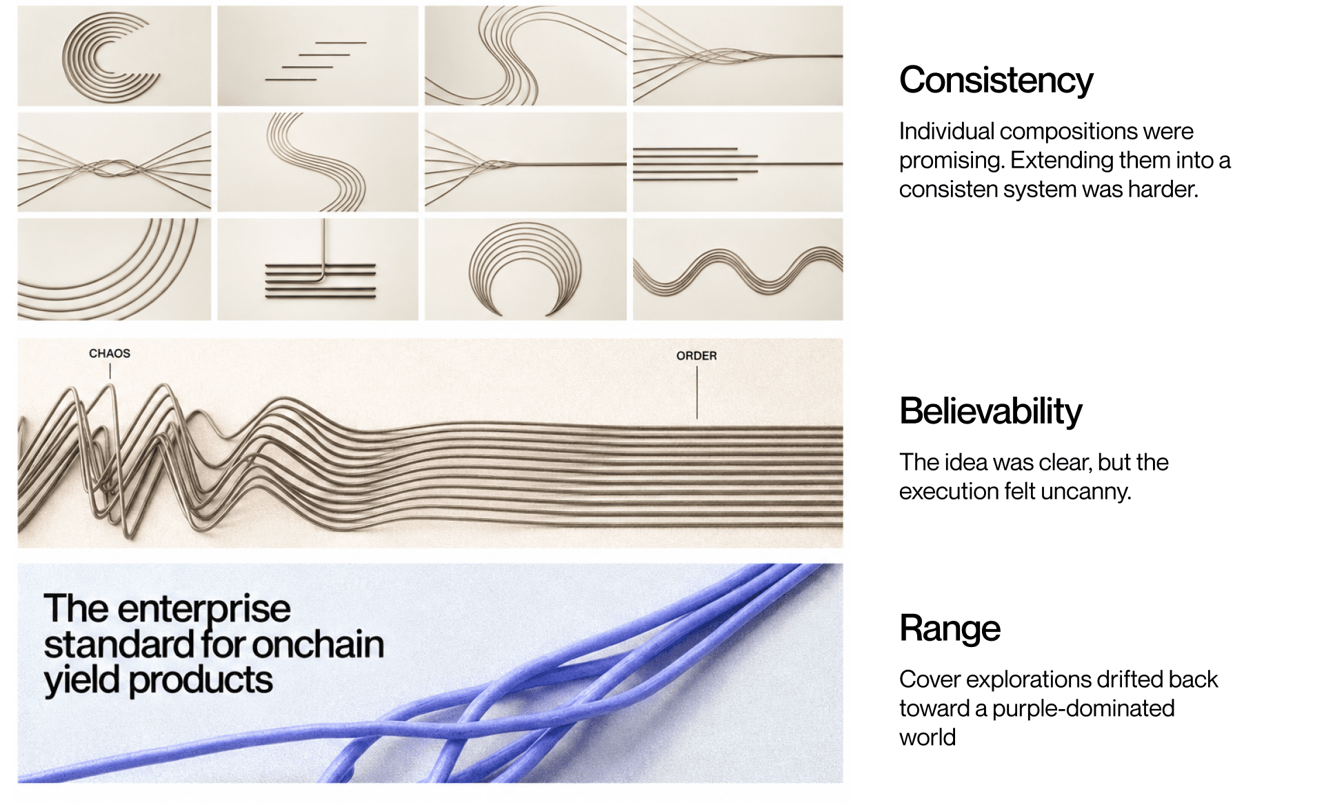
An image showing chaos resolving into order captured an idea I wanted to communicate, but it also had an uncanny, AI-generated quality. Other experiments worked as presentation covers, yet drifted away from metallic rods into purple forms that filled the composition. I was beginning to lose the restraint I’d been trying to establish.
Sun and I were in a constant feedback loop. Over time, we gathered pieces we both responded to into one mood board. I didn’t yet know exactly how they would come together. I knew they gave us material worth expanding upon, and I trusted that spending more time with them would reveal what belonged.
That board became my reference for the next couple of months. It gave us enough shared direction to explore with purpose, without pretending we had already resolved the whole brand.
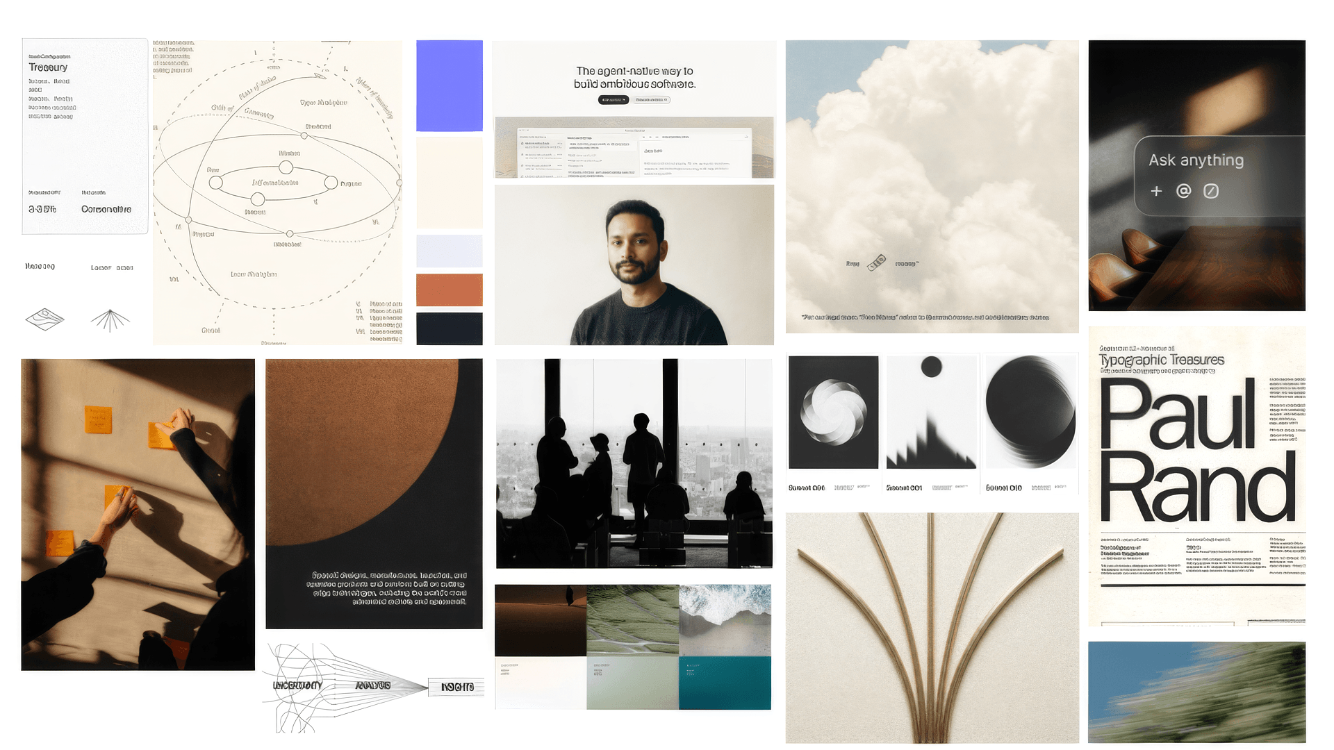
I began organizing the visual language around what someone needed from Veda. Social imagery could give them a reason to look closer. The website needed to make the offering understandable. Decks, demonstrations, and proposals needed the precision to support a business decision.
I no longer needed every piece to do everything. The brand needed enough range to serve those different moments, with the principles holding it together.
Giving the ideas a natural form
Nature became part of that range because of what Veda enables. We help businesses make idle capital productive, and I kept returning to how nature expresses productive potential: a seed becomes a tree that produces more seeds.
As I explored further, I found relationships that could guide specific images. Riverbanks shape pathways for currents to follow, giving me a way to express an app becoming a neobank that attracts and directs capital. For capital moving between chains, I thought about something I see every year in Canada: geese in migration.
The language of finance made these connections feel familiar. We already talk about capital flowing, liquidity, and currency in circulation. Nature gave those ideas a visual form that someone could recognize before understanding the infrastructure underneath.
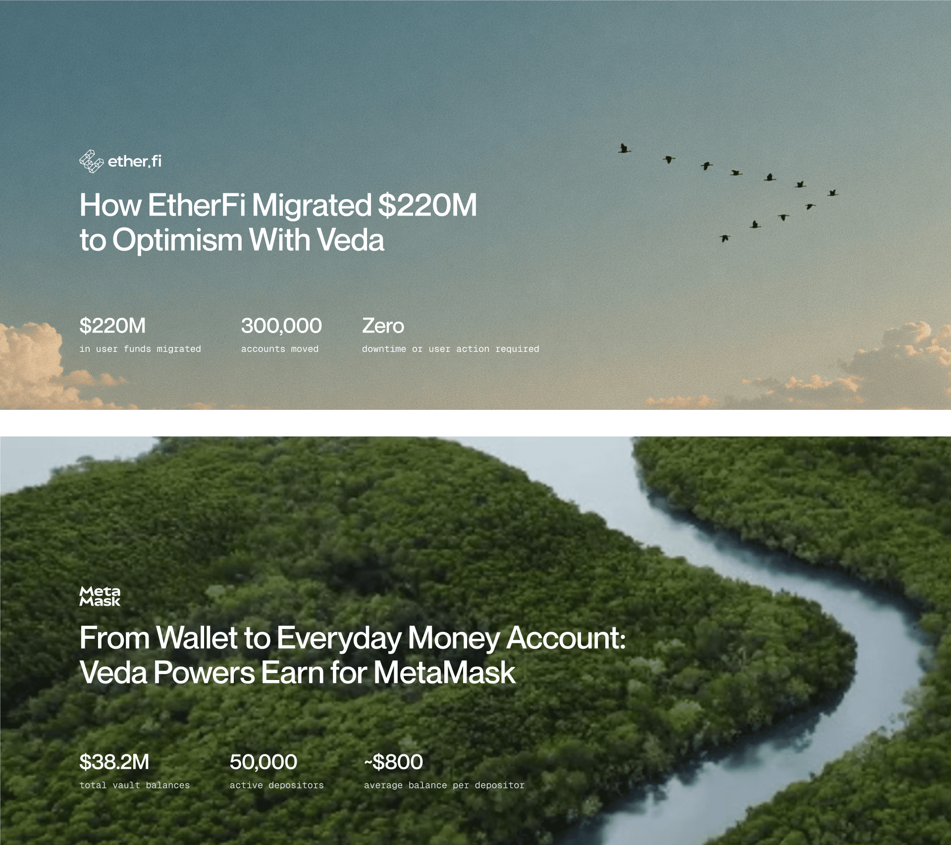
The elemental language gave us more room to explore across the communications we were publishing. Sky, water, and fire brought different moods and movement into the work, while shared typography and composition kept the applications connected.

Together with the architectural diagrams, this gave us a language that could invite someone into the idea and help them understand its mechanics. The homepage was where we needed to bring those expressions into one experience.
Making the offer clear
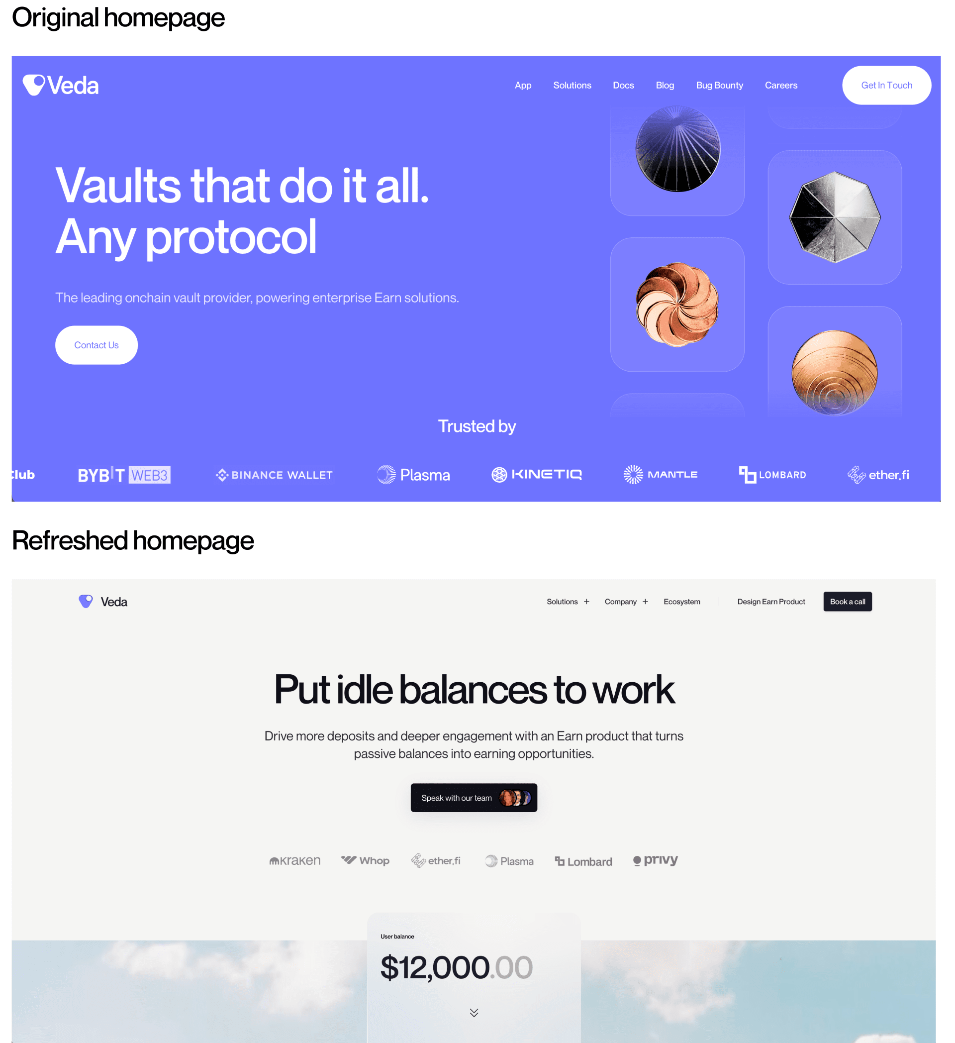
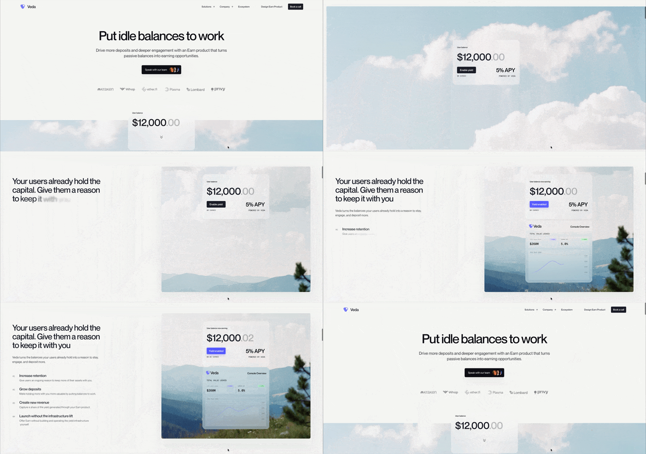
For the homepage refresh, we kept the opening clear: a value proposition, an invitation to speak with the team, and proof of our customer base on a paper grain texture. Slightly below the fold, a cropped fintech interface sparked curiosity. Behind it, a sky background invited people to scroll.
As someone scrolled, the interface revealed a static balance. Earn appeared, and the balance began to grow. I wanted visitors to experience the same moment of understanding that had helped me grasp the offering: seeing what the infrastructure could make possible inside a product they recognized.
Further down the page, the ecosystem section gave us another opportunity to explain Veda through motion. Its logos begin scattered and disordered. As someone scrolls, they settle into an organized composition, expressing how Veda brings structure to a fragmented onchain system.
I wanted that transition to make our role visible. A visitor could see the pieces coming together before needing to understand how we connected them.

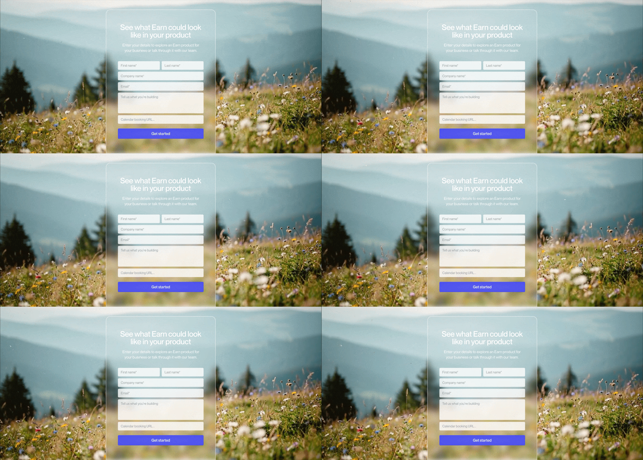
At the bottom of the homepage, we return to the landscape. The opening begins in the clouds; the final view brings us down to a field of sprouting flowers. That closing image carries the idea of productive potential that first drew me toward nature, giving it a place at the end of the experience.
Bringing Veda into view
Seeing the homepage come together was a relief after months of research and sometimes agonizing creative work. There were stretches when I could no longer tell whether the pieces belonged together. I kept nudging pixels, questioning decisions, and returning to ideas that felt true but hadn’t yet found their place. On the homepage, I could finally see what all that work had been building toward.
I hadn’t arrived with a complete vision for Veda. Sun and I developed it by understanding the company, making the work, and seeing what held up as we pushed it further. The challenge was learning to distinguish between something I liked and something the brand could keep growing from.
In Joshua Tree, I’d felt proud of what we had built at Circle and restless to build again. Veda gave me that opportunity. Six months later, we have a foundation I believe in, and a clearer sense of what we’re building together.
Finding Veda has meant learning to recognize what was already there, then doing the work to make it visible. My own moment of clarity became the experience we wanted to give someone else: an understanding of what Veda makes possible, and a reason to explore it.
A thank you to everyone who helped bring this homepage to life: Sun Raghupathi, our CEO; Josh Kessler, our CBO; Matthias Broner, Veda’s former VP of Marketing; Leo Galante, our Product Engineer; and Shruti Saha, Omer Erdogan, and Benjie Dagunan from Spring Studio. I’m grateful for the care, thought, and craft you each brought to the work, and for helping turn a shared vision into something we could put into the world.
More From Blog

How DeFi Goes Mainstream

Banks, the Window Is Closing